Sankey Diagram: The Essential Tool for Visualizing and Optimizing Your Energy Flows
In today's industrial landscape where every kilowatt-hour counts, Sankey diagrams have become the strategic tool for understanding, analyzing, and optimizing your energy flows with unprecedented precision.
Industrial companies using Sankey diagrams for their energy balance identify on average 10-30% additional savings compared to traditional energy tracking methods.
This comprehensive guide explains how to implement this powerful tool, interpret your energy flows, and transform these insights into concrete optimization actions.
Executive Summary – Energy Sankey Diagrams
The Sankey diagram is not just a visualization tool: it's an energy flow analysis methodology that reveals invisible losses, quantifies inefficiencies, and prioritizes optimization actions. This article explains how to create and interpret these energy schematics, presents 4 concrete industrial use cases, and shows how the Wattnow platform automatically generates dynamic Sankey diagrams from your energy data, identifying 10-30% potential savings.
To deepen your energy strategy, discover our guide on energy management systems.
What is an Energy Sankey Diagram?
Discover the basic principles of this energy flow visualization tool that revolutionizes industrial consumption analysis.
Definition and Origin
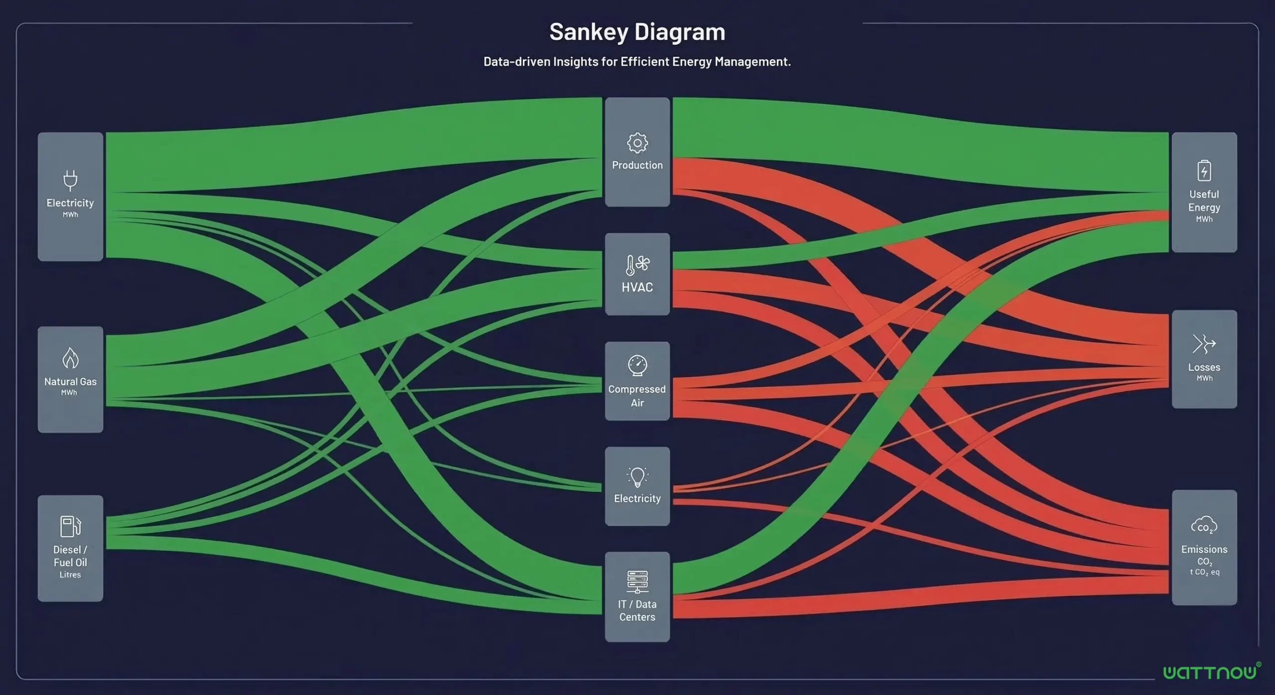
A Sankey diagram is a graphical representation of energy flows where arrow widths are proportional to the amount of energy flowing. Invented by Captain Sankey in 1898 to analyze steam engine efficiency, it's now indispensable for industrial energy balance.
Proportionality Principle
The width of each arrow corresponds exactly to the energy flow it represents. An arrow twice as wide = twice as much energy. This visual principle immediately identifies the most energy-intensive processes and main losses.
Flow Hierarchy
The diagram organizes flows from left (sources) to right (uses). Each bifurcation shows how energy distributes between different processes, highlighting losses at each transformation stage.
Why It's Revolutionary for Industry
Unlike Excel tables or classic charts, the Sankey diagram makes the invisible visible: it shows not only how much energy is consumed, but especially where it goes, how it transforms, and where it's lost. In an automobile factory for example, it reveals that 40% of incoming electrical energy is ultimately lost as unrecovered waste heat.
To know which energy KPIs to track alongside Sankey diagrams, check our guide.
4 Concrete Use Cases of Sankey Diagrams in Industry
Discover how different industrial sectors use this energy flow analysis tool for significant gains.
Automotive Plant
Problem: High energy bill without understanding responsible processes.
Sankey Solution: Flow visualization from electrical intake to workshops (presses, painting, assembly).
Result: Identification that 35% of painting workshop energy is lost in oversized ventilation.
Data Center
Problem: High PUE (Power Usage Effectiveness) at 1.8.
Sankey Solution: Mapping electrical flows between servers, cooling, lighting, losses.
Result: Revelation that 45% of energy serves cooling, enabling free cooling optimization and PUE reduction to 1.4.
Thermal Power Plant
Problem: Low overall efficiency at 38%.
Sankey Solution: Detailed analysis of stack, condensation, auxiliary losses.
Result: Identification that 12% of losses come from absence of flue gas heat recovery.
Chemical Site
Problem: Uncontrolled process energy costs.
Sankey Solution: Tracking energy from utilities (steam, compressed air) to reactors.
Result: Discovery that 28% of produced steam is lost through defective steam traps.
These use cases show the importance of a complete energy monitoring solution to industrialize these analyses.
Visualize Your Energy Flows in Real-Time
Discover how Wattnow automatically generates dynamic Sankey diagrams from your data to identify 10-30% savings.
Real-time data • Automatic generation • Multi-flow analysis
How to Create and Interpret an Energy Sankey Diagram
Follow this 5-step methodology to implement this consumption optimization tool in your company.
Collect Energy Data
Measure consumptions at each key point: energy intakes (electricity, gas, purchased steam), transformations (boilers, compressors), final uses (machines, processes). Use IoT sensors for optimal accuracy.
Structure the Flows
Organize data in hierarchy: incoming energies → transformations → final uses → losses. Define consistent units (kWh, GJ, toe) and conversion coefficients.
Generate the Diagram
Use specialized tools (Wattnow, Python + Plotly, online tools) to create the visualization. The Wattnow platform automates this step from your IoT data.
Analyze Insights
Visually identify: widest flows (priority processes), proportionally significant losses, inefficient bifurcations, gaps between similar units.
Define Corrective Actions
Prioritize actions according to savings potential: reduce widest losses, optimize inefficient transformations, recover waste energies.
Pitfalls to Avoid
Incomplete data: A Sankey diagram based on partial data gives a distorted view. Measure all significant flows (>5% of total consumption).
Inconsistent units: Mixing electrical and thermal kWh without appropriate conversion coefficients.
Insufficient frequency: An annual diagram masks seasonal variations and temporary malfunctions.
For a structured approach, discover how our energy management software can frame your optimization approach.
Sankey 2.0: Dynamic Energy Visualization with Wattnow
Wattnow transforms the traditional Sankey diagram into an operational management tool with advanced features for Industry 4.0.
Automatic Generation
No more manually creating your energy schematics. Wattnow automatically generates Sankey diagrams from your IoT sensor data, with real-time updates.
Multi-Granularity Analysis
Zoom from complete industrial site down to a specific machine. Compare diagrams between different workshops, shift teams, or periods (day/night, summer/winter).
Intelligent Alerts
Receive automatic alerts when your Sankey diagram morphology changes abnormally: sudden widening of a loss flow, modification of proportions between uses.
Sensor Deployment
Our experts install necessary sensors on your critical energy points in 2-3 days.
Automatic Configuration
The Wattnow platform automatically creates your flow hierarchy and generates the first Sankey diagram.
Training and Autonomy
We train your teams to interpret diagrams and identify priority optimization areas.
Discover our expertise and how we support over 800 industrial sites.
Switch to Dynamic Sankey with Wattnow
Join 150+ industrial companies visualizing and optimizing their energy flows in real-time.
Personalized demo • Flow analysis • Expert consultation
FAQ – Energy Sankey Diagrams
Visualize the Invisible, Optimize the Essential
Sankey diagrams transform complex energy data into actionable insights. With Wattnow, move from static visualization to dynamic energy performance management.
30-minute demo • No commitment • Personalized flow analysis

